OVERVIEW
Planning Group Trips Without the Stress.
Role
Product Designer
Team
Independent Project
Timeline
June 2025 - Sept 2025
Tools
Figma
FigJam
CONTEXT
Group trip planning isn't hard because people don't care…
Trip planning is hard because information is everywhere and decisions feel overwhelming and complex.
THE PROBLEM
Planning trips is overwhelming and requires a lot of communication and commitment

As someone who loves to go on trips with friends and plan them, this is a conversation I have had way too many times with friends. My high school friends and I all go to different colleges with break schedules that often don’t align, unless it is summer break. However, even then, we struggle with planning a trip due to how busy our schedules are. Having repeatedly experienced the conversations of wanting to go on a trip, but it never happens, I set out to solve this issue, so…How might we design a product that streamlines the process of group trip planning by reducing the friction of scheduling, budgeting, and aligning individual interests?
USER RESEARCH
How do friend groups currently plan trips?
I wanted to gain a better understanding of how friend groups go about planning for trips and any frustrations they come across. After interviewing Cornell students and students from other colleges, I identified key trends and insights:
Scheduling is a challenge to Trip execution, especially for friends who go to different colleges or for those with overwhelming schedules
Budget and expenses are a major limiting factor for students to go on trips, often delaying or cancelling plans because of it
It is difficult to satisfy everyone in the group due to different interests
Trip planning is overwhelming, resulting in delays or Trips “not making it out of the group chat.”
Logistical issues (e.g., distance and transportation) result in changes to original plans during planning and during the trip.
While analyzing these insights, I developed 3 main user personas that represented the target audience’s needs and pain points

After analyzing user interview data and key insights, I was able to understand the frustrations that friend groups face while trip planning. This led me to formulate 2 main pain points to address for this project.
1
Limited budgets and logistics constrain trips
Students often cancel or delay trips due to financial limits or transportation barriers.
Opportunity areas
community feature where other college students share lodging, transportation, activities, food etc that are cheap but good
budget/expense tracker
2
Group planning is stressful and unorganized
Whether it be finding a time that works for everyone, balancing different interests, managing logistics, or keeping track of decisions. This leads to trips getting stuck in endless group chats.
Opportunity areas
polls for decision making
“TLDR” page
Trip page where all details are consolidated into one area
including trip habits survey into onboarding for users to “have a say in decisions” when they are not present --> friends can look at their trip habits and “decide for them”
IDEATION
Exploring key features to simplify and lessen the stress of the trip planning process
Considering user research findings and key pain points, I created low-fidelity sketches to visualize the main features of Roamies. These included foundational screens like Home, Profile, Trip, Community, and Search/Explore, as well as features such as polls, reviews/posts, and curated lists of student recommendations.
Profile


Community

Home


Log in/Sign up

Trip

Search/explore
ITERATIONS & SOME USER TESTING
Keeping the goal of helping friend groups plan trips with ease in mind while designing
After sketching low-fidelities, I created mid-fidelity wireframes to hone in on features that would aid in addressing users’ pain points in trip planning
Home Page Iterations
To target the pain point of “Group planning is stressful and unorganized”, I decided to create the home page as a “TLDR”(Too Long Didn’t Read) space where students who are too busy to stay up to date or read every message can still be involved and give input on the trip. It aims to reduce feelings of being overwhelmed by providing a quick way to stay updated and participate. I decided to focus on features that allowed users to complete tasks easily, be up to date on recent decisions made, and understand what was talked about in the trip chats without having to scroll and read through hundreds of messages.
Hi Selena!
Lets get ready for NYC!
Activites Poll
4/9
Finish Questionnaire
4/10
To dos
Complete by
Recent Decisions
4
Greyhound
3
Amtrak
2
Flixbus
Transportation
Chat Highlights
The Roses
Elle proposed going to The Rose Concert during trip; $65 tickets; Joyce agreed; Christine still deciding; Waiting for Selena’s input
New York City, NY
Option 1
To do list with due date
To do list requires multiple clicks to land on the task
Chat highlights are dense and hard to easily skim
Hi Selena!
Here’s what you missed!
1 day left
Due: 5/15
Which Museum?
The Metropolitan Museum of Art
MoMA
The Guggenheim
Salon 94
Send Poll
To dos
Poll Decisions
Greyhound
Amtrak
Flixbus
Transportation
Chat Summary
The Roses
Elle proposed going to The Rose Concert during trip
$65 tickets
Joyce agreed; Christine still deciding
Waiting for Selena’s input
New York City, NY
Option 2
Displaying To dos directly
Bulleted chat summary
Polls indicate who voted for what
Polls are visually dense
Use of “Send Poll” button could be misleading
Overwhelming “To do” section
Hi Selena!
NYC’s in 10 days, let’s get ready!
Recent Decisions
Transportation
Greyhound
4
Amtrak
1
Flixbus
3
Which Museum?
The Metropolitan Museum of Art
MoMA
The Guggenheim
Salon 94
Submit Vote
More Details
Urgent Tasks
1
2
3
3
Chat Summary
The Roses
Elle proposed going to The Rose Concert during trip
$65 tickets
Joyce agreed; Christine still deciding
Waiting for Selena’s input
1 day left to vote!
New York City, NY
Option 3
Ability to focus on urgent tasks
“More Details” button
Emphasize on users input in chat summary
Possibly visually dense or overwhelming
I decided on Option 3 because it emphasized easy and quick access to making decisions and being up to date on chats. I decided to change the “To dos” feature to just Urgent tasks to allow quick and easy decision-making by fewer clicks. It is designed to be easily completed so that even busy students can have a say during the trip planning process. Upon user testing, I found that users may not know all the options in a poll (Salon 94 in this case). Option 3 allows users to click into the poll and learn more about individual options, their prices, reviews, and see photos. I decided to only display how many people voted instead of displaying user profiles because it was more visually dense for each poll option, potentially overwhelming the already overwhelmed user. Option 3 emphasizes, through bolding, when user input is needed in chat summaries so that users do not miss out on important conversations.
Trip Page Iterations
When iterating on how each trip would be displayed for users, I realized having one page for a trip was going to be too dense, overwhelming, and hard to find information. I decided to split each trip into 3 sections: Trip Details, Planning, and Personal (For me). This was to keep trip planning organized and make it easier for information to be found.
Trip Details Page Iterations
For this page, I wanted to create a space where basic trip information can be found easily. This included who was going, what everyone should remember, collective expenses, and eventually bookings.
New York City, NY
The Roses
Trip Details
To dos
Travelers
View Itinerary
Group Expenses
May 20 - May 25
Group Reminders
Pack Sneakers!
Arrive to bus station by 9:10AM!

Selena
Elle
Joyce
Christine
$180.66
Group To-dos
Transportation
Lodging
Option 1
Group expenses isn’t clear
“Group to dos” vs.“To dos” is confusing
Placement of”View Itinerary” button may not be intuitive or familiar
Accessibility issues with unlabeled buttons
New York City, NY
The Roses
Trip Details
Personal
Planning
Travelers
Bookings
View Itinerary
Group Expenses
May 20 - May 25
Group Reminders
Pack Sneakers!
Arrive to bus station by 9:10AM!
spent
$180.66
$150.26 → Transportation
$130.40 → Lodging
Selena
Elle
Joyce
Christine
Add Expense
Add Reminder
Add Booking
Syracuse Bus Station → New York Port Authority
Departs: May 20, 9:25AM
Arrival: May 20, 2:10PM
EVEN Hotel New York - Midtown East, an IHG Hotel
Check-in: May 20, 3PM
New York Port Authority → Syracuse Bus Station
Departs: May 25, 5:30PM
Arrival: May 25, 10:40PM
Option 2
Bookings displayed
Group expenses are more clearly displayed
Buttons clearly indicate their use
Overwhelming amount of information at top and in bookings
Trip Details
Planning
For me
Travelers
Selena

Elle
Joyce
Christine
Group Reminders
Pack Sneakers!
Arrive to bus station by 9:10AM!
Add Reminder
See all
See all
Bookings
New York Port Authority → Syracuse Bus Station
EVEN Hotel New York - Midtown East, an IHG Hotel
Check-in: May 20, 3PM
Departs: May 25, 5:30PM
Syracuse Bus Station → New York Port Authority
Departs: May 20, 9:25AM
Add Booking
Group Expenses
$180.66
$150.26 → Transportation
$130.40 → Lodging
Add Expense
spent
The Roses
View Itinerary
May 20 - May 25
Option 3
Bookings information is clear
Can click on bookings for more information
“For me” tab is more personable than “Personal”
Could become visually dense
I decided on option 3 because it provided important information easily for users who are busy and may easily miss important decisions. Option 3 allows users to easily access booking details which can often get lost in thousands of emails. The group expenses tracker allows transparency on where money is being spent so that there are no surprises at the end of the trip, avoiding any awkward conversations about splitting money. Option 3 provides a clear divide between all the different sections so that the interface is not overwhelming and is easy to find information.
Planning Page Iterations
My goal for this page was to make coordinating trip logistics effortless and to give every group member a chance to contribute to the planning. The features I focused on were Tasks, Availability, Polls, and eventually Saved spots. These features aimed to consolidate endless conversations about trip logistics into a space where planning and decision-making is simple and quick.
View Itinerary
The Roses
May 20 - May 25
Polls
NYC Activities
The Metropolitan Museum of Art
Central Park
Salon 94
NYC Ferry Ride
Send Poll
See All
See All
Tasks
Book Reservation for Take31
Call EVEN hotel and ask about holding suitcases
Selena
Joyce
10 days left
15 days left
Trip Details
Planning
For me
Add Task
Availability
Joyce
May 20-26
Christine
May 20-26
Selena
May 20-26
Elle
May 20-26
Add Availability
Option 1
Full visibility to planning aspects (availability, polls to complete)
No automatic calculation of availability
Information and visually dense
Joyce
May 20-26
The Roses
May 20 - May 25
Availability
Polls
1 day left to vote!
NYC Activities
The Metropolitan Museum of Art
Central Park
Salon 94
NYC Ferry Ride
Submit Vote
More Details
See all
See all
See all availabilities
Tasks
Add availability
Book Reservation for Take31
Selena
10 days left
Call EVEN hotel and ask about holding suitcases
Joyce
15 days left
All Available:
Trip Details
Planning
For me
Add Task
View Itinerary
Option 2
Automatic calculation of availabilities
Individual availabilities shown
Prioritizing tasks instead of availability
Availability section is visually dense
Availability
Polls
See all
See all
Tasks
Book Reservation for Take31
Selena
10 days left
Call EVEN hotel and ask about holding suitcases
Joyce
15 days left
All Available: May 20 - May 25
Saved spots
1 spot saved
Trip Details
Planning
For me
Finish by: 4/9
1 day left to vote!
More Details
NYC Activities
Central Park
Submit Vote
The Metropolitan Museum of Art
Salon 94
NYC Ferry Ride
1
1
3
3
Add Task
Create new poll
Add spots
Add availability
See all
See all
The Roses
View Itinerary
May 20 - May 25
Option 3
Availabilities are automatically calculated
Ability for everyone to create polls
Ability to save spots specific to the trip
Prioritizes actionable content
I went ahead with Option 3 because it reduced planning stress and encouraged easy participation in the planning process. Availability is automatically calculated, making it easy for users to figure out when the trip can occur. This resolves the burden of having to figure out which days overlap between travelers. Participation is encouraged through actionable buttons such as “Create new poll” so everyone in the group can help plan, not just the original organizer. This allows the usual trip planner to be less overwhelmed by allowing all users to take action in the planning process.
Personal (For me) Page Iterations
For this page, I wanted to create a space where users can stay on top of their own tasks and expenses. A personal space for the specific trip. The features I focused on included reminders and to-dos, and an expenses tracker.
Trip Details
Expenses
Reminders
Planning
For me
Book Reservation for Take31
Bring black boots
Wake up by 8
The Roses
View Itinerary
May 20 - May 25
Add Reminder
Add Expense
See all
spent
$180.66
Breakdown
Food
Activities
Transportation
Lodging
The Roses
View Itinerary
May 20 - May 25
Edit Budget
Option 1
Breakdown of expenses by category, budgeting by category
Reminders and Tasks are grouped together
Trip Details
Expenses
Reminders
Planning
For me
Bring black boots
Wake up by 8
Edit Budget
Left
$500.00
$0
$180.66
Recent Transactions
See All
Today
EVEN Hotel New York
- $130.40
Lodging
Greyhound Bus Ticket
- $150.26
Transportation
$319.34

The Roses
View Itinerary
May 20 - May 25
Add Reminder
Add Expense
To dos
Book Reservation for Take31
10 days left
Add To do
See all
See all
See all
The Roses
View Itinerary
May 20 - May 25
Option 2
To dos and Reminders are separate
Amount left, spent, budget and recent transactions are all shown
I decided to go with Option 2 because it emphasized greater awareness on spending and allowed for a clearer divide between tasks that needed to be completed for the group versus gentle reminders. The expenses tracker showcases total money spent and how much is left in relation to the budget. Emphasizing how much is left allows users to be aware of how much more money they can spend without having to subtract each expense every time, keeping budgeting easy.
Community Page Iterations
The community page is a secondary content exploration space where users can find reviews on trip elements(transportation, lodging, activities, food, etc) from their community and, in turn, add them to their trip plans. I wanted to target the pain point of difficulty in finding trip elements that were in budget for students or cheap. Students can scroll through reviews by peers they know or trust who share the desire to have fun while staying on budget. Students can find trip elements that match what they want from peers who are similar to them.
Near Me
Cheap
Free
Museums
Roamies
Christine explored The Metropolitan Museum of Art w/ Joyce, Elle, Selena
Notes: Pay as you wish tickets for NYS students!! Giant museum and lots of great art pieces
Notes: great to explore
$ - 5th Ave, NYC
Joyce explored Central Park w/ Christine, Elle, Selena
Free, NYC
4.5, $1-10 - Museum - Low Effort
4.5, Free - Park- Low Effort
Option 2
Filters makes it easy to find activities/food etc, that are within budget
Map features allows users to see if that activity, food, etc is nearby
Lack of descriptions and ratings makes it not very useful as a secondary explore page
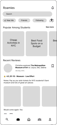
Option 2
Search bar instead of icon emphasizes the use of page as a explore page
Interaction features (like, comment) → community engagement
“Popular Among Students” section → easy browsing in common filters
“Add to trip button more visible”
I chose Option 2 because it prioritized the use as a secondary content exploration space while also being a Community page. The addition of the “Popular Among Students” section allows users to browse through lists of activities, lodging, etc, and find inspiration for their trip plans. Option 2 also enhances community engagement through features such as liking and commenting. This page makes it easy for users to scroll through and add options to their trip that align with their goals. The addition of the “Would come again” question provides a more accurate sense of how worth it is that activity, in this case, as reviews can often be positive and high, but the experience was not good enough to go again. Upon user testing, I learned that the “Add to Trip” button was hard to find due to users needing to scroll before seeing it. I thought about moving it to the top of the review; however, there would be accessibility issues with that, as many buttons would be close together. Ultimately, I decided to keep the button near the bottom of the review; however, I moved it up slightly so it is visible at first glance.
FINAL DESIGNS
And now, I present to you Roamies! A way to plan trips with your friends without being overwhelmed.
Communicate Trip Habits and Stay up to Date on Planning
Trip habits survey incorporated into onboarding as a way for friend groups to understand each other without having awkward conversations, as well as making decisions for the trip, considering their trip habits if they aren’t available. TLDR (Too Long Didn’t Read) Home page keeps travelers up to date and makes trip planning quick


Centralized Hub for Planning
Stay organized while planning, preparing, and experiencing your trip with everything you need in one area. Keep track of expenses through a budget tracker and transparency
Find Cheap But Fun Lodging, Transportation, Activities, & Food
With an explore and community page, discover in-budget trip essentials already experienced by other college students.

REFLECTION
Becoming a better designer
Roamies was a personal project I undertook during the summer after my freshman year. It was my second official product design project and it helped me reestablish what I learned in Intro to Digital Product Design. I wanted to create a product that showcased more product thinking and human-centered design skills, rather than visual design, which was what my first-ever UX project was on. I’m proud of how much I have grown since the start of this project!
If I had more time
Due to the tight schedule I was following to complete this project before the school year, I only did user testing with a small pool of people. In the future, I hope to conduct more testing to improve the user experience on Roamies. I would also like to explore a leaderboard feature to incentivize posting reviews for the community. As well as a feature of being awarded souvenirs whenever a trip is complete. I hope to continue to change and improve upon Roamies through critiques and more user research so that it becomes an application that streamlines the trip planning process, so more time can be spent on memories and roaming the world.